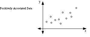
Positively Associated Data
Positively Associated Data
A relationship in paired data in which the two sets of data tend to increase together or decrease together. In a scatterplot, positively associated data tend to follow a pattern from the lower left to the upper right. Positively associated data have a positive correlation coefficient.
See also
Key Formula
r=[n∑x2−(∑x)2][n∑y2−(∑y)2]n∑xy−(∑x)(∑y)
Where:
- r = Correlation coefficient; for positively associated data, r is between 0 and 1
- n = Number of data pairs
- x = Values of the first variable (independent variable)
- y = Values of the second variable (dependent variable)
- ∑xy = Sum of the products of each paired x and y value
- ∑x = Sum of all x values
- ∑y = Sum of all y values
Worked Example
Problem: Five students recorded the number of hours they studied and their test scores: (1, 50), (2, 60), (3, 65), (4, 80), (5, 90). Determine whether the data are positively associated by computing the correlation coefficient r.
Step 1: List the values and compute the needed sums. Here n = 5.
∑x=1+2+3+4+5=15
Step 2: Find the sum of y values and the sum of the products xy.
∑y=50+60+65+80+90=345∑xy=50+120+195+320+450=1135
Step 3: Find the sum of squared x values and squared y values.
∑x2=1+4+9+16+25=55∑y2=2500+3600+4225+6400+8100=24825
Step 4: Substitute into the correlation coefficient formula.
r=[5(55)−152][5(24825)−3452]5(1135)−(15)(345)=(275−225)(124125−119025)5675−5175=50⋅5100500
Step 5: Simplify to find r.
r=255000500=505.0500≈0.990
Answer: The correlation coefficient r ≈ 0.99, which is positive and very close to 1. The data are strongly positively associated — as study hours increase, test scores increase.
Another Example
This example uses a real-world context (temperature vs. sales) and starts with a visual/scatterplot observation before confirming numerically, showing that positive association can often be identified by the pattern of the data before computing r.
Problem: A store tracks the temperature outside (°F) and the number of cold drinks sold over four days: (60, 20), (70, 25), (80, 40), (90, 50). Without computing r exactly, determine from a scatterplot description whether the data show positive association, then verify with the correlation formula.
Step 1: Plot the points mentally or on paper. As temperature (x) increases from 60 to 90, drinks sold (y) increases from 20 to 50. The pattern rises from lower left to upper right, suggesting positive association.
Step 2: Compute the required sums with n = 4.
∑x=300,∑y=135,∑xy=60(20)+70(25)+80(40)+90(50)=1200+1750+3200+4500=10650
Step 3: Find the sums of squares.
∑x2=3600+4900+6400+8100=23000∑y2=400+625+1600+2500=5125
Step 4: Apply the formula.
r=[4(23000)−3002][4(5125)−1352]4(10650)−(300)(135)=(92000−90000)(20500−18225)42600−40500=2000⋅22752100
Step 5: Simplify.
r=45500002100=2133.12100≈0.984
Answer: r ≈ 0.984, confirming strong positive association. Higher temperatures correspond to more cold drinks sold.
Frequently Asked Questions
What is the difference between positively associated data and negatively associated data?
Positively associated data have variables that increase together (r > 0), so the scatterplot rises from lower left to upper right. Negatively associated data have one variable increasing while the other decreases (r < 0), so the scatterplot falls from upper left to lower right. The key distinction is the direction of the trend.
Does positive association mean one variable causes the other?
No. Positive association shows that two variables move in the same direction, but it does not prove causation. There could be a hidden third variable (a confounding variable) driving both. For example, ice cream sales and drowning incidents are positively associated, but hot weather is the underlying cause of both — ice cream does not cause drowning.
Can data be positively associated but not perfectly linear?
Yes. Data can be positively associated with any r value between 0 and 1 (exclusive). An r of 0.4, for instance, indicates a weak positive association — the general trend is upward, but the points are scattered widely around the trend line. Only r = 1 represents a perfect positive linear relationship.
Positively Associated Data vs. Negatively Associated Data
| Positively Associated Data | Negatively Associated Data | |
|---|---|---|
| Direction of trend | Both variables increase or decrease together | One variable increases while the other decreases |
| Correlation coefficient (r) | 0 < r ≤ 1 | −1 ≤ r < 0 |
| Scatterplot pattern | Rises from lower left to upper right | Falls from upper left to lower right |
| Real-world example | Height vs. weight in people | Price of a product vs. quantity demanded |
| Slope of best-fit line | Positive slope | Negative slope |
Why It Matters
Identifying positive association is one of the first skills you learn in statistics and data analysis. You encounter it when studying scatterplots in algebra, in science classes when analyzing experimental data, and in standardized tests like the SAT. Understanding whether data are positively associated helps you make predictions — if you know the trend, you can estimate one variable's value from the other using a line of best fit.
Common Mistakes
Mistake: Assuming positive association means causation.
Correction: Correlation does not imply causation. Two variables can move together because of a third, hidden factor. Always look for confounding variables before concluding that one variable causes another.
Mistake: Thinking any upward-looking cluster of points means strong positive association.
Correction: Strength depends on how tightly the points cluster around a line. A loose upward cloud might have r = 0.3 (weak positive association), while tightly packed points along a line could give r = 0.95 (strong). Always check the correlation coefficient to judge strength, not just the general direction.
Related Terms
- Paired Data — The type of data used to assess association
- Scatterplot — Graph used to visualize positive association
- Correlation Coefficient — Numerical measure that confirms positive association
- Negatively Associated Data — Opposite direction of association
- Set — Collection of data values forming each variable
- Line of Best Fit — Has positive slope for positively associated data
- Linear Regression — Method to model the positive trend mathematically